Viski Reserve Glassware
Art Direction, 2022-2023
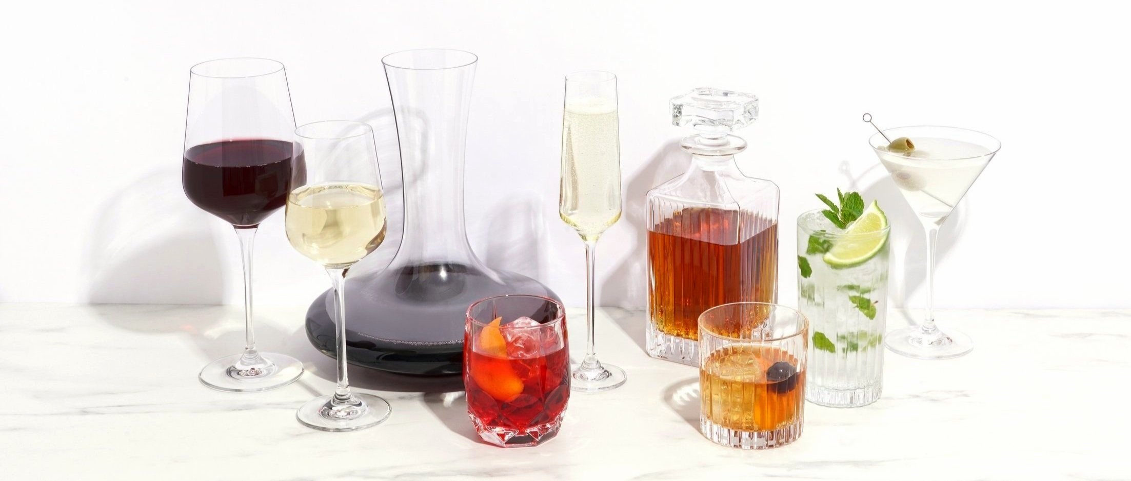
Viski is a brand of refined, professional-quality barware and glassware designed for the home mixologist. When the opportunity arose to build an exclusive collection of European-made crystal glasses, Viski wanted to create elevated packaging in order to separate the line from their everyday glassware. An upgraded logo lockup, lifestyle-centric photography, and more opportunities for storytelling brought the Reserve collection to new heights.

Background
For the initial collection launch, my team was tasked with designing marketing collateral for both B2B and D2C audiences. That’s when I noticed an obvious divide in content strategy between what the product team approved for packaging, and what I was being directed to create for marketing.
Through self-initiated discussions with the Marketing Director and Brand Manager, we reached an agreement that it would be in the customers’ best interest to update the design of the packaging before the next round of ordering. I was tasked with leading the project with the Creative team and providing Creative Strategy, Art Direction, and Project Management.
Creative Brief
As a first step, I created a Creative Brief for the design team that would be working on the project so they had an outline of expectations, deliverables, and research to use as a foundation for their designs.
Goals & objectives
Two design concept proposals with moodboards
Competitor analysis
Special considerations requested by stakeholders
Design & Photography Sprints
Over the course of four months, I led four rounds of design sprints with a team of three designers. We also worked with our in-house photography team to test-shoot multiple photo concepts for the front and side panels of the boxes. Meeting with the stakeholders at the end of each round, it was my responsibility to ask targeted questions, document feedback, and direct the next steps for the Creative team.


Final Packaging
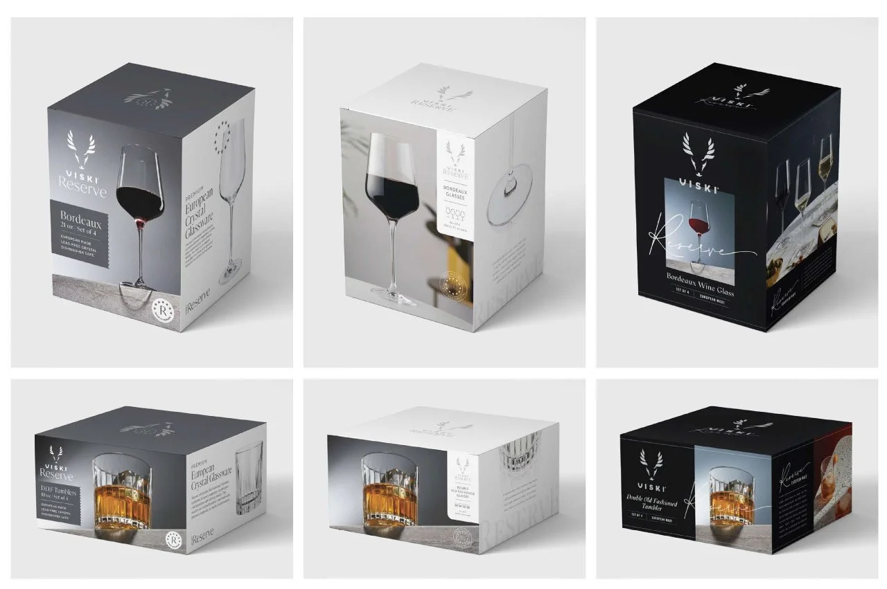
The final concept is simplified, with only one glass shown at an upward angle and the logo freed out of the container on the left side. The Reserve collection name has a larger presence and is styled in an old-world-inspired script typeface. We also created a large “Made in Europe” symbol and used the right panel to dive deeper into the story of their construction and quality.

Initial Design
Updated Design

Dieline of Updated Design
Retail Impact
The updated packaging can be seen in-store on the top shelf with the previous version below. The captivating hero shot shines bright with increased contrast and shadows that stand out on the shelf. A more prominent logo and content-rich side panels illuminate the brand’s style and allow customers to better understand the quality and sophistication. The overall response to the update was positive from retailers and consumers alike. The product team has developed two new styles and twelve individual glasses since the relaunch in mid-2023.

